Advertisement


Cell-phone data suggest that we're already staying home less
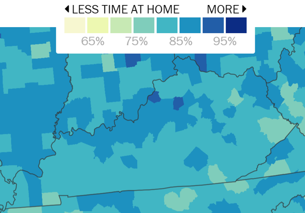
Anonymized cell-phone data indicate, county by county, how much Americans are obeying stay-at-home restrictions imposed to fight the covid-19 pandemic. Kentuckians appear to be getting out more.
Data from SafeGraph, as anaylzed and presented by The Washington Post, show that the first week of April was "the peak period of our collective, coronavirus-induced lockdown," but "The numbers vary greatly by geography."
That is made clear from the map that the Post produced from the SafeGraph data; online, it is interactive, giving data by county.
A similar project, by the University of Maryland, presents cell-phone mobility and other data in bar graphs by date. It shows that Kentucky's social-distancing index peaked at 73 on April 12 and gradually declined for the rest of the month, except for weekends. On April 30, it was down to 24, on a scale of 100. That was the lowest it had been since 23 on March 16, the Monday after major shutdowns began. The site has data going back to Jan. 1, and the "Counties" option can be selected to create bar graphs for any county.
* * *
Kentucky Health News is an independent news service of the Institute for Rural Journalism and Community Issues, based in the School of Journalism and Media at the University of Kentucky, with support from the Foundation for a Healthy Kentucky.
![]()
Advertisements


Clicking on an ad will open the advertiser's web site or a larger view of the ad. Advertise with us!
Advertisements